
Every sweet treat gets its own icon. A cohesive redesign illustration set built for menus, packaging, and everything in between.
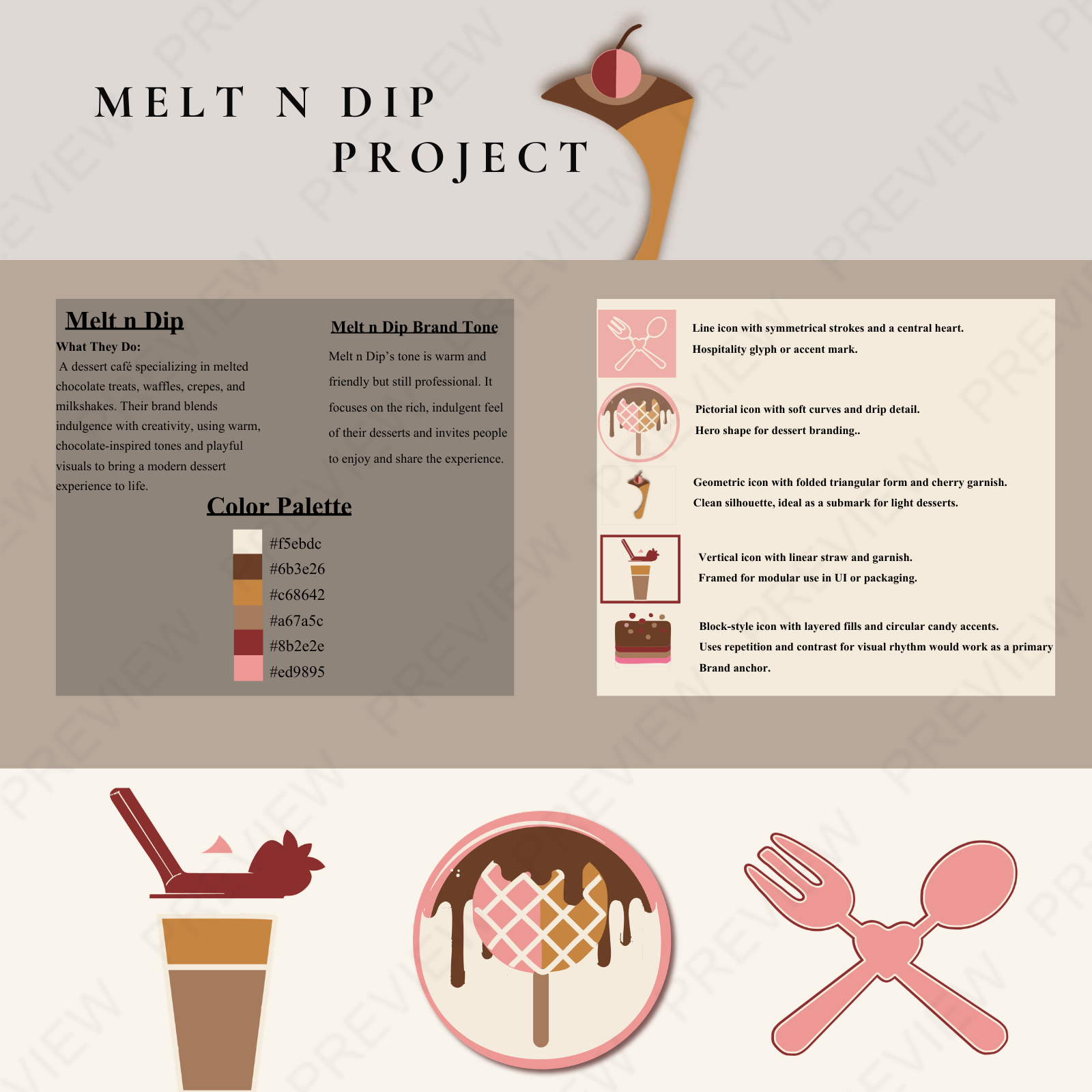
A brand as rich as the desserts it represents. The Melt & Dip identity redesign balances warmth, playfulness, and sweet indulgence.
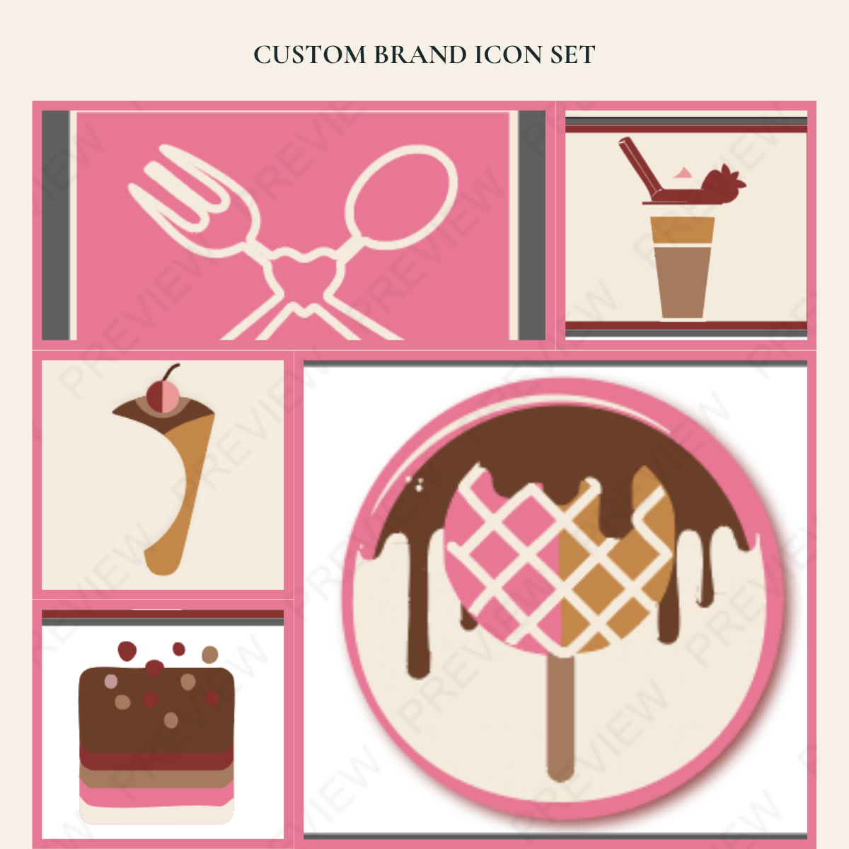
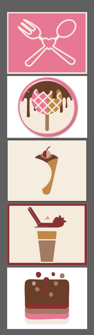
Consistent by design. Every icon in the family follows the same weight, style, and spirit - so the brand always looks like itself.