Safe House Project brand identity refresh by Amanda Vest showing redesigned color system in warm blue and gold with updated typography guidelines for a national survivor-support nonprofit

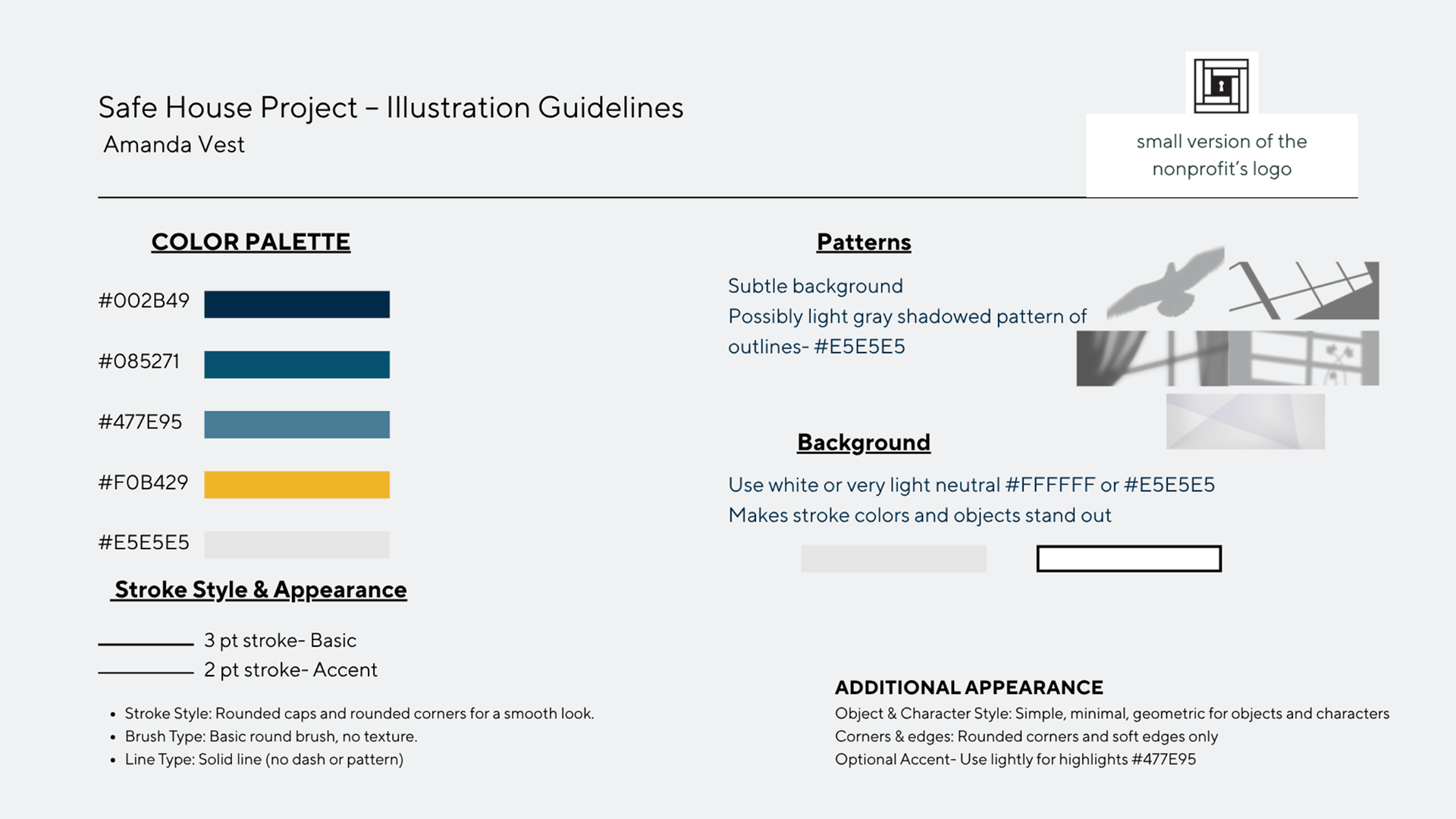
A refined palette that still feels like shelter - warm, trustworthy, and built to communicate safety at a glance.

Safe House Project brand redesign collateral by Amanda Vest showing refreshed nonprofit visual identity applied across awareness materials with compassionate and protective design language

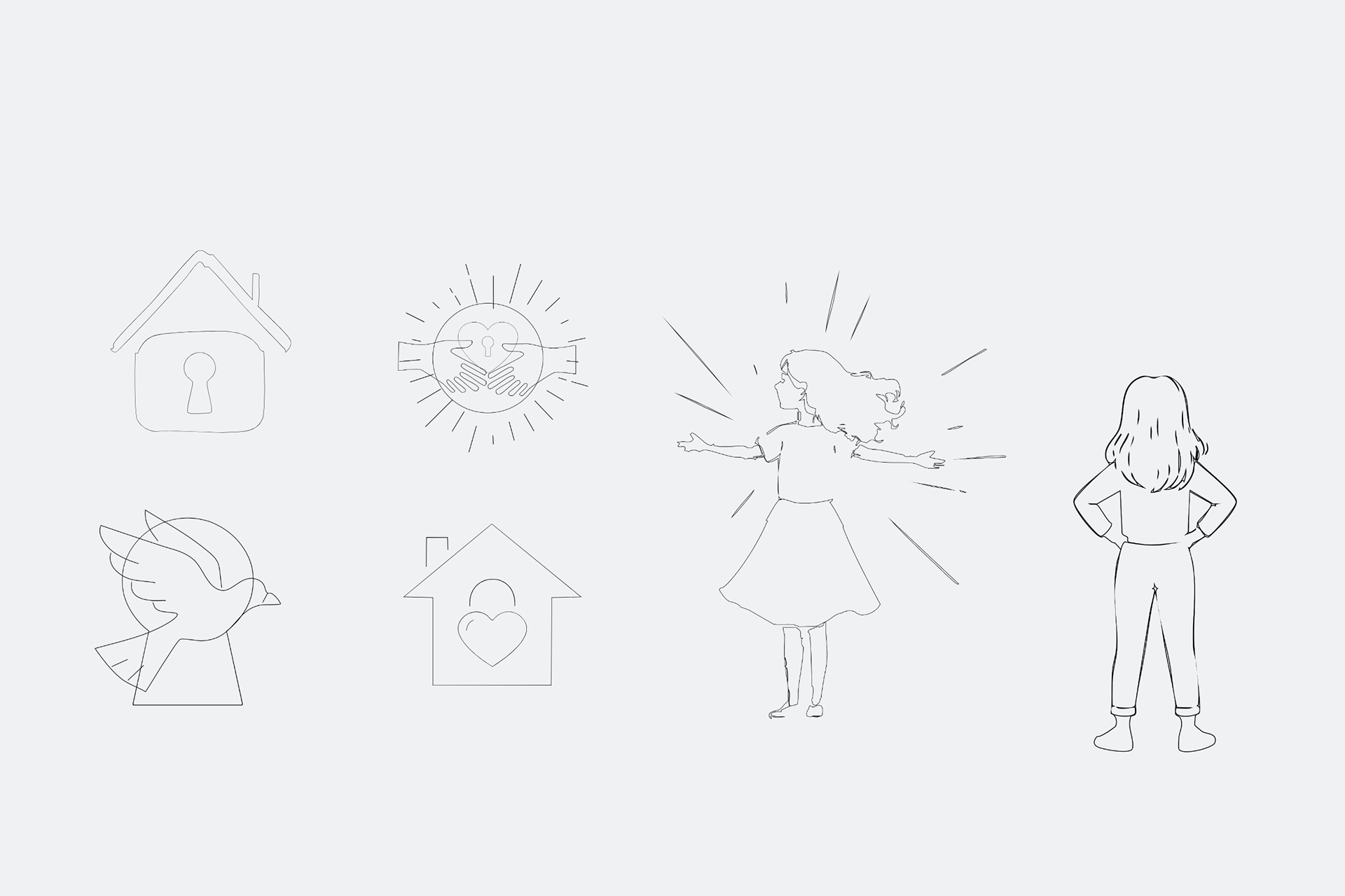
Same mission, stronger voice. A redesign that keeps the heart of the brand intact while sharpening everything around it.

Safe House Project nonprofit logo redesign by Amanda Vest — updated brand mark featuring hope-driven blue and dark yellow color palette with compassionate, empowering visual identity

Not starting from zero - starting from purpose. This redesign honors what Safe House stands for while giving their mission the visual strength it deserves.

You may also like

Back to Top